Overview
Objectives: Drive App Downloads from Users and Obtain Funding from Investors
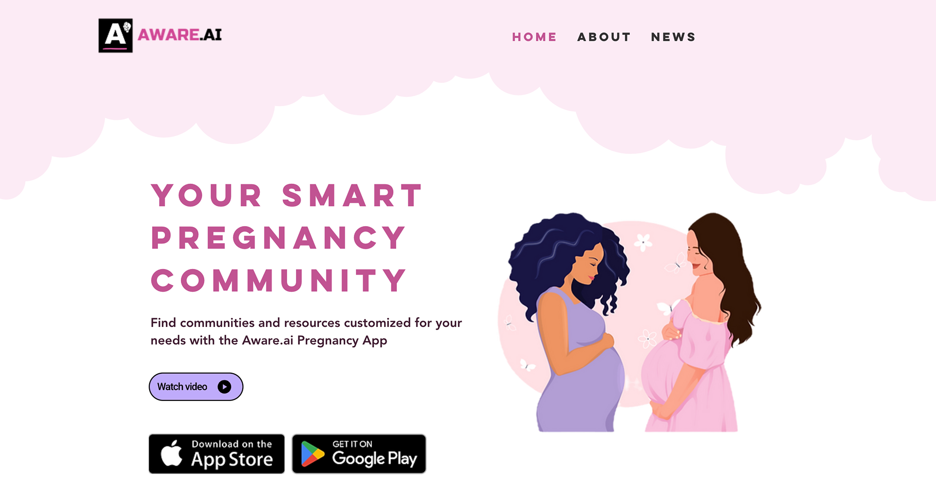
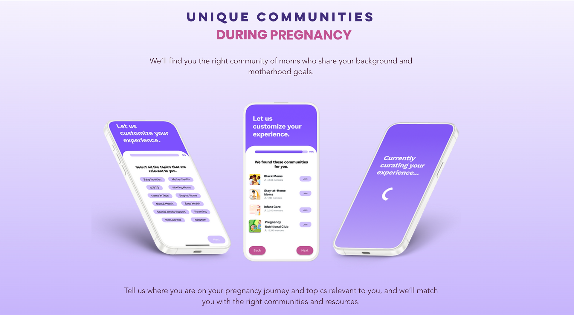
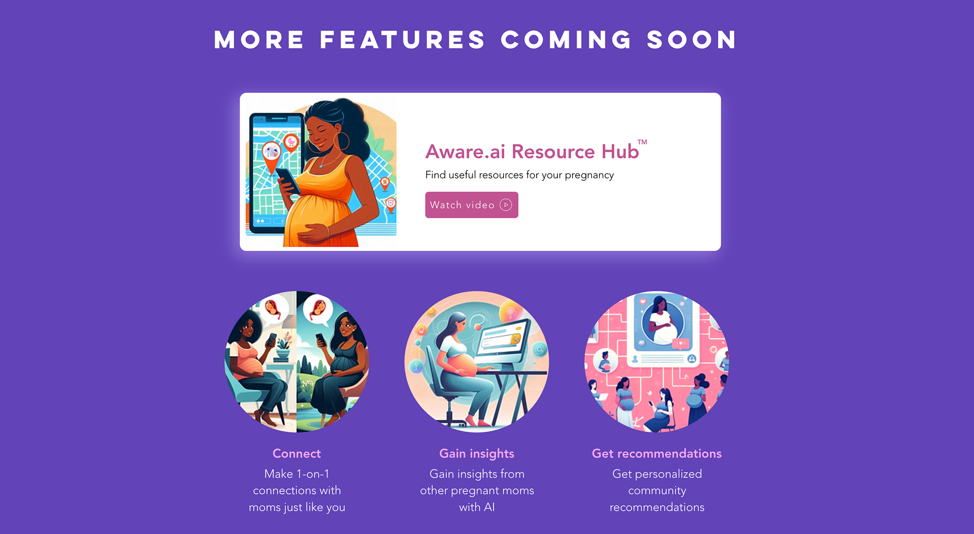
Over a period of three weeks, I redesigned the website to highlight community connections and promote app downloads. The secondary objective was to attract potential investors to finance the startup.
To accomplish these objectives, I accentuated the existing Communities feature and provided a sneak peek of upcoming features to showcase the app's potential.
The Need to Rebrand the Website
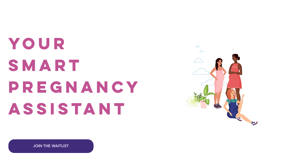
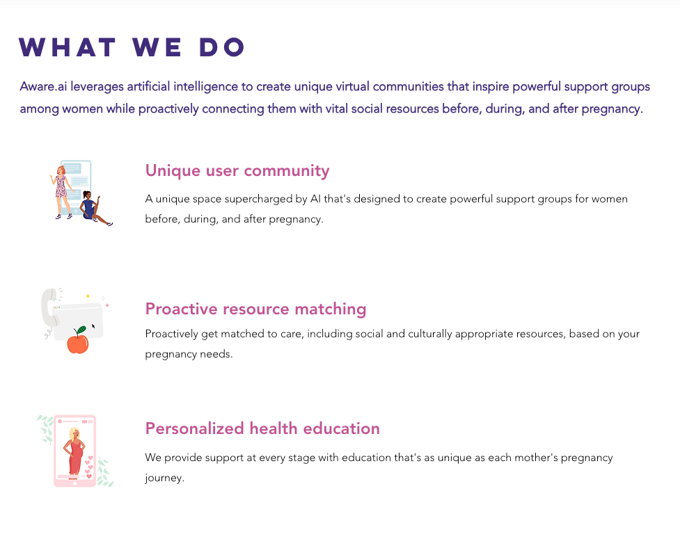
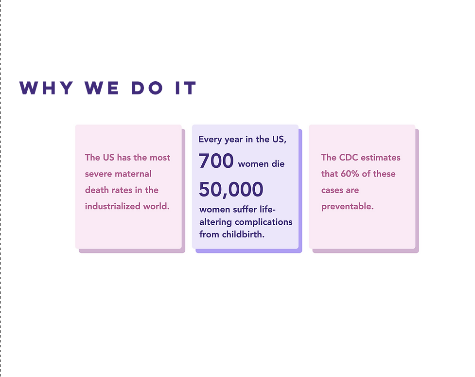
The previous version of the website, created on Wix in 2020, predates the current version and direction of the app.
With the app's impending launch, a website redesign is necessary. The updated site will highlight the app's features, emphasizing community, engagement, and connection.
Competitive Advantage: Leveraging AI for Diverse Mom Community Recommendations
The most crucial task was to create a clear value proposition that sets Aware.ai apart from competitors such as Facebook Groups and Peanut. Finding active communities on other platforms can be overwhelming and time-consuming. The Aware.ai Pregnancy App simplifies this process by using AI to recommend communities based on the mother's status, demographics, and interests.
First Step: Researching Websites for Design Inspiration
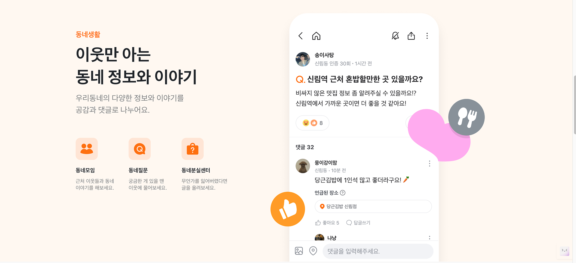
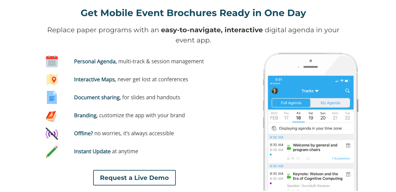
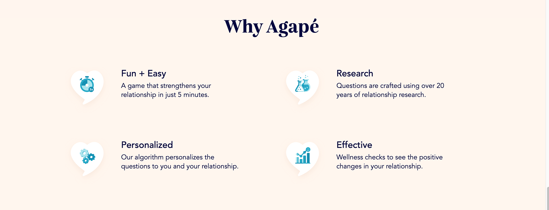
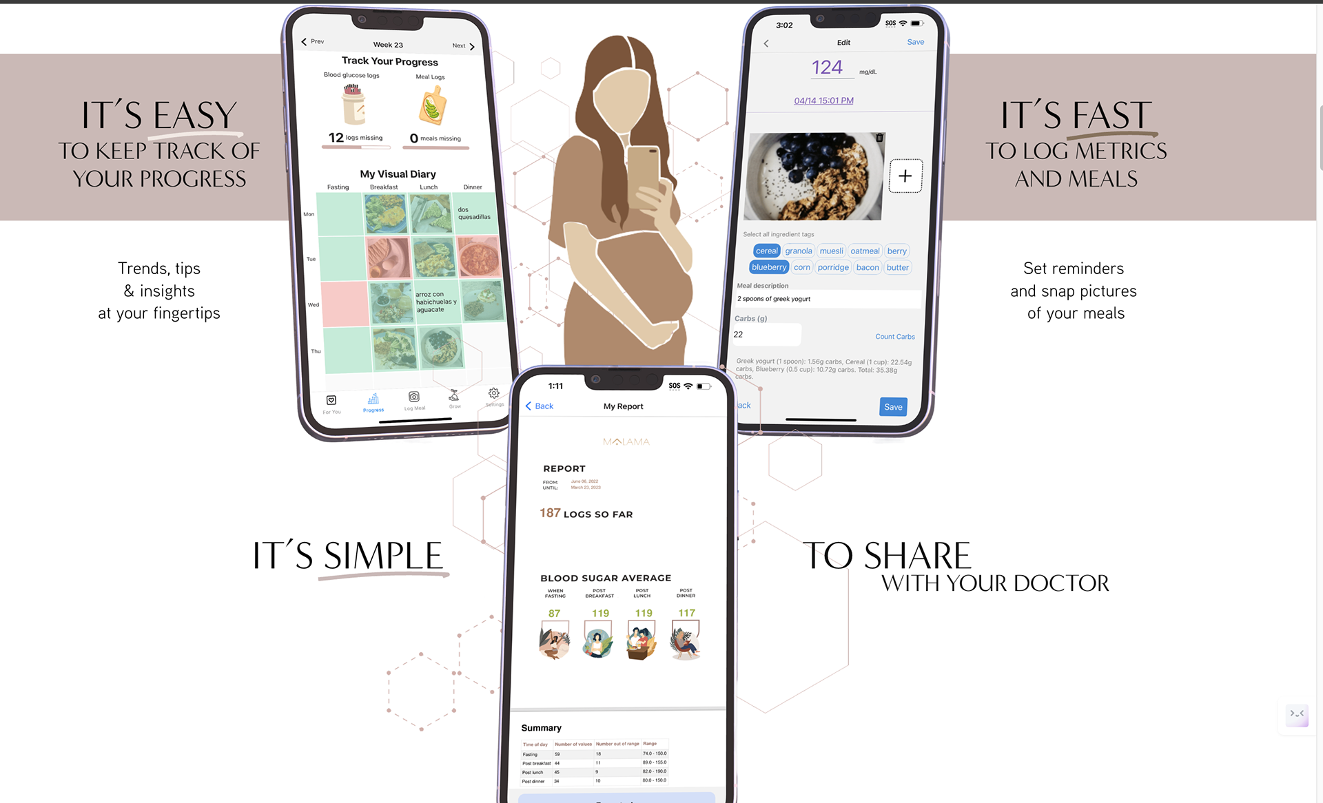
After conducting a comprehensive study of other websites for mobile apps, I gathered inspiration that fed into the design of the new website. I drew from the most engaging elements to ensure the app's unique value proposition stood out.
Creating Different Versions Low-Fi Wireframes to Gather Feedback
I combined design elements from my research to create two versions of low-fidelity wireframes for the landing page. From there, I asked for feedback and iterated on the flow and layout of the website. The final layout followed the version on the right.
Drawing the Flow of the Website's Landing Page
After incorporating feedback into my designs, I finalized the flow of the landing page. The website engages the reader with a hero section that encapsulates the essence of the Aware.ai Pregnancy App, including a button for downloading the app—the main action. The website then narrates the features of the app, shares testimonials from other mothers, and includes forms to collect email addresses for marketing purposes.
Final Designs: Showing the Current Features and Teasing Upcoming Features
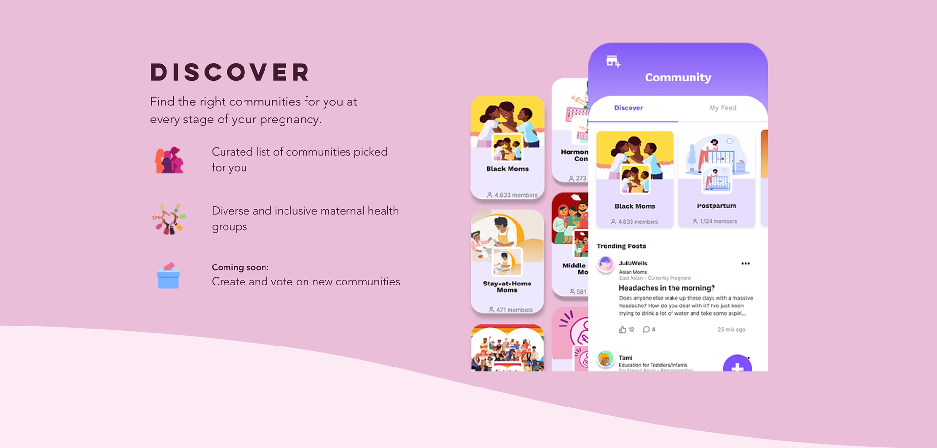
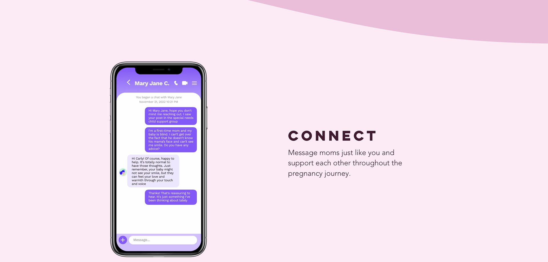
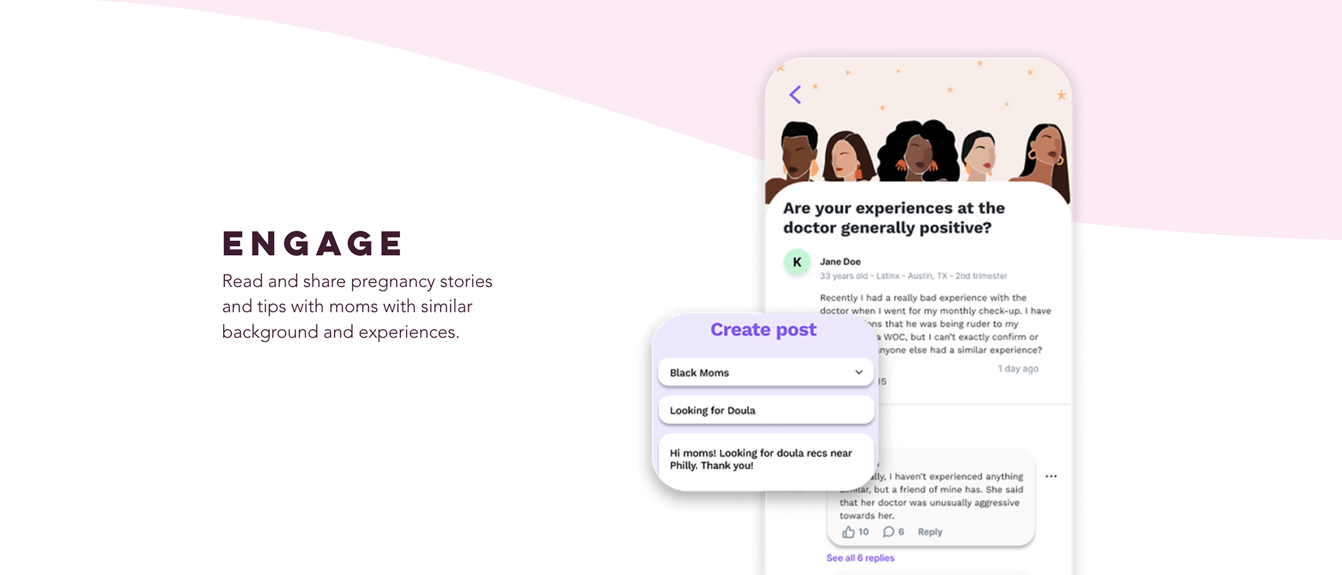
Upon launch, the app included features such as finding communities, sharing posts, and chatting with other moms. Although these features were not drastically different from other apps, Aware.ai was also developing additional exciting features behind the scenes. The challenge lay in promoting these new features without divulging too much information to competitors.
Instead of revealing everything, I provided small hints about upcoming features. I included a high-level overview of these features, using AI-generated images created by ChatGPT and Microsoft Designer. This approach ensured that I did not disclose too much, while still keeping readers curious and excited about the future of the Aware.ai Pregnancy App.
Establishing Credibility With User Testimonials and Press
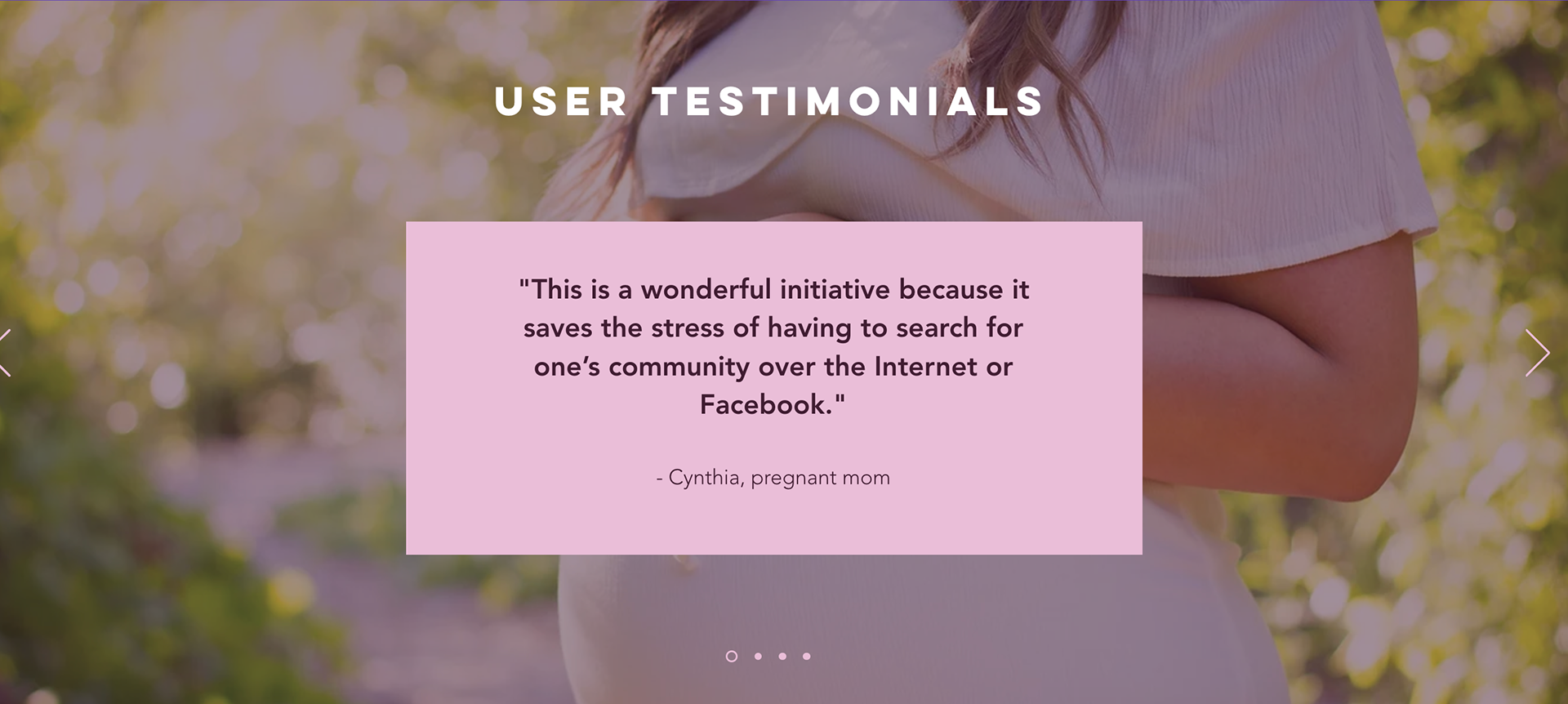
Establishing trust and credibility prior to the app's launch presented another challenge. Given the significant weight of peer recommendations, testimonials were vital. Fortunately, I had conducted a user testing campaign of an earlier app version with 58 target audience members, gaining insights into their opinions and app preferences.
I selected a few testimonials from this campaign that emphasized the value of the communities. By displaying positive user feedback and including news articles about Aware.ai, I catered to the need for social proof, enhancing the app's credibility.
Creating a Compelling Introduction Video
While a website can describe an app's functionality, it may not emotionally engage users to motivate them to download the app. Multimedia content, particularly that which includes human faces, is highly effective in storytelling and conveying complex ideas memorably.
Using Canva, I created an introductory video that brought the website content to life. It not only showcased app screenshots, but also featured images and videos of pregnant women. This video was then posted on social media and integrated into the website.
The Two Most Important KPIs to Measure
The primary objective of the website is to increase app downloads. Therefore, the key performance indicators (KPIs) to monitor are related to conversion:
1. The count of individuals who clicked the 'Download' button
2. The count of individuals who registered for the mailing list
Though the mailing list does not directly contribute to app downloads, it provides a selection of emails for targeted email marketing, aiming to convert these contacts into app users over time.
Final Thoughts
This website redesign project was unique because it was part of broader marketing strategies aimed at increasing app downloads. I was involved in the entire process.
My user testing campaign provided testimonials and insights about what users value in our app. After launching the website, I didn't simply generate daily social media posts leading up to the app's debut, directing viewers to the website.
I also oversaw email marketing campaigns for individuals who had subscribed to our mailing list. This project enhanced my understanding of the relationship between design and marketing strategy and improved my storytelling skills.
